
Introduction
Color plays a pivotal role in the world of fashion—not merely as an aesthetic choice, but as a strategic tool that influences perception, mood, and personal expression. The interplay of hues, tones, and contrasts contributes to how garments are received and remembered, both by the wearer and the observer. Whether one is curating a personal wardrobe, styling a photoshoot, or developing a fashion brand, an understanding of color theory enables more informed and intentional choices.
In the highly visual realm of fashion, color can distinguish a signature look, evoke emotion, and communicate identity before a word is spoken. Fashion professionals and enthusiasts alike can benefit significantly from mastering color theory, as it provides a framework for styling with coherence, creativity, and confidence. This article explores how foundational principles of color theory can be applied to achieve success in fashion—both artistically and commercially.
What is Color Theory?
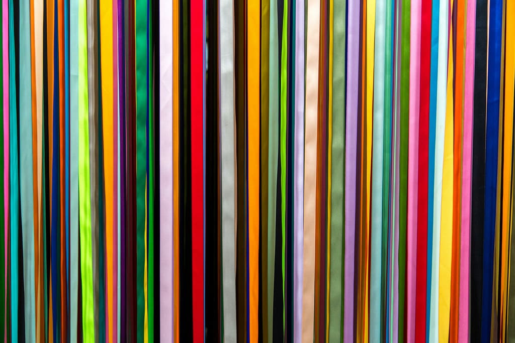
Color theory is a framework that explains how colors interact, combine, and contrast to create visually appealing results. Rooted in both art and science, it offers a structured way to understand the relationships between colors, making it an essential tool in design—including fashion.
At the heart of color theory lies the color wheel, a circular diagram first conceptualized by Sir Isaac Newton in the 17th century. The wheel organizes colors based on their visual relationships, dividing them into:
- Primary Colors: Red, blue, and yellow—these cannot be created by mixing other colors.
- Secondary Colors: Green, orange, and purple—formed by mixing two primary colors.
- Tertiary Colors: Six shades made by mixing a primary color with a neighboring secondary color (e.g., red-orange, blue-green).
Beyond just identifying colors, color theory explores three critical components:
- Hue: The pure color itself.
- Saturation: The intensity or vividness of a color.
- Value: The lightness or darkness of a color.
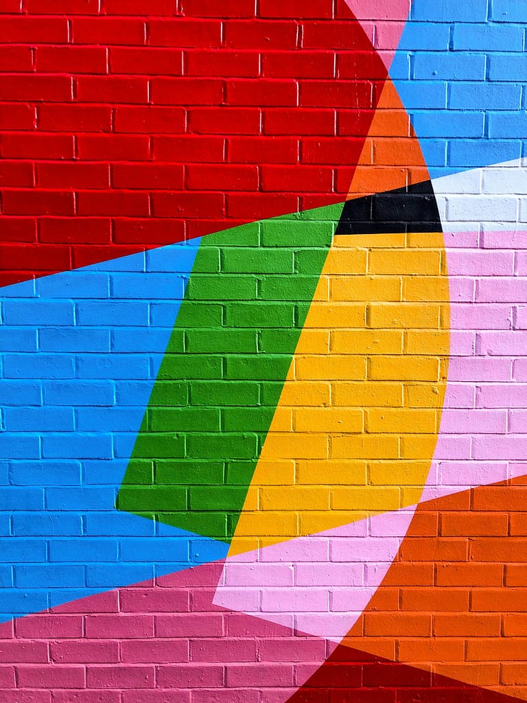
Key Color Harmonies and Their Use in Fashion
Color harmony refers to combinations of colors that are aesthetically pleasing when used together. In fashion, understanding these harmonies allows designers and stylists to create outfits that are visually balanced, impactful, and expressive. Here are the main types of color harmonies and how they can be applied:
Complementary Colors
These are colors that sit opposite each other on the color wheel (e.g., blue and orange, red and green). When paired, they create high contrast and vibrant looks. In fashion, complementary color schemes are often used for bold, eye-catching ensembles or to highlight specific features, such as accessories or statement pieces.
Analogous Colors
Analogous colors sit next to each other on the color wheel (e.g., blue, blue-green, and green). These combinations offer subtle harmony and are ideal for creating cohesive, serene looks. They’re perfect for layered outfits, monochrome variations, or styling within a specific mood or season.
Triadic Colors
Triadic schemes involve three colors evenly spaced on the color wheel (e.g., red, yellow, and blue). This approach produces vibrant, balanced outfits with a playful or creative feel. In fashion, using one dominant color with the other two as accents often yields stylish and well-rounded results.
Monochromatic Colors
Monochromatic schemes involve variations in lightness and saturation of a single hue. This results in sleek, elegant looks that appear intentional and refined. It’s a popular choice in minimalistic fashion and capsule wardrobes where simplicity and cohesion are key.
Understanding and applying these color harmonies can help elevate everyday outfits, make editorial styling more compelling, and support fashion branding with a consistent visual identity.
Warm vs. Cool Colors in Fashion
One of the foundational concepts in color theory is the division of hues into warm and cool categories. This distinction plays a crucial role in fashion, influencing how colors affect mood, visual temperature, and how they complement skin tones.
Warm Colors
Warm colors include reds, oranges, yellows, and variations of these hues. They evoke feelings of energy, passion, and warmth. In fashion, warm tones are often used to create bold, inviting, and confident looks. They’re great for drawing attention and making a statement, especially in outerwear, accessories, or evening wear.
Examples in fashion use:
- A vibrant red dress for power and allure
- Mustard yellow accents to evoke retro charm
- Burnt orange coats for cozy autumn aesthetics
Cool Colors
Cool colors include blues, greens, and purples. These shades are associated with calmness, serenity, and sophistication. They tend to have a soothing effect and are ideal for creating elegant, professional, or relaxed ensembles.
Examples in fashion use:
- Navy or slate suits for formal wear
- Mint green for a fresh, spring-ready outfit
- Lavender or icy blue for a soft, dreamy vibe
Understanding the warm-cool color divide helps fashion professionals and enthusiasts coordinate outfits with emotional intent and visual harmony. Mixing warm and cool tones skillfully can also add contrast and depth, while staying within a chosen aesthetic.

Color Psychology in Clothing
Color not only affects how an outfit looks—it also influences how it feels and what it communicates. This is the core of color psychology, a field that explores how colors evoke emotional responses and shape perception. In fashion, leveraging color psychology can help create purposeful looks that align with the wearer’s mood, role, or desired impression.
Common Color Associations in Fashion
- Red: Passion, power, confidence. Often used in statement pieces to grab attention and express boldness.
- Blue: Trust, calm, professionalism. A popular choice for workwear, uniforms, and smart casuals.
- Black: Authority, sophistication, elegance. A staple in fashion for its slimming effect and timeless versatility.
- White: Purity, simplicity, freshness. Frequently used in minimalism or formalwear for a clean, modern feel.
- Green: Nature, balance, renewal. Earthy tones for sustainable fashion or vibrant greens for energy.
- Yellow: Joy, optimism, creativity. Adds warmth and spontaneity to an outfit but can be overwhelming if overused.
- Purple: Luxury, mystery, imagination. A favorite for avant-garde designs or regal fashion statements.
- Pink: Romance, youthfulness, playfulness. Often used to soften an outfit or add a feminine touch.
Fashion designers, stylists, and brands use these psychological associations to build mood boards, plan collections, and influence how consumers emotionally connect with garments. For the individual, understanding color psychology allows for more intentional wardrobe choices—dressing not only for appearance but for influence.

Fashion Trends and Color
Color trends are powerful drivers in the fashion industry, shaping collections, influencing consumer choices, and setting the tone for each season. These trends are often informed by cultural movements, technological influences, and societal moods—making them both timely and expressive.
How Designers Use Color Theory in Trends
Fashion designers and brands rely heavily on color theory when developing seasonal lines. They use color harmonies to create cohesive collections and align pieces with broader emotional or conceptual themes. For instance, a designer may use complementary colors for visual drama on the runway or stick to a monochromatic palette to express minimalism and purity.
Fashion houses also consider:
- Target market preferences
- Global events and cultural shifts
- Pantone’s Color of the Year (e.g., Viva Magenta 2023, Peach Fuzz 2024)
- Streetwear and social media influences
Recent Color Trends
Recent years have seen a mix of bold and soft shades taking the spotlight:
- Dopamine Dressing: Bright colors like neon green, hot pink, and vivid yellow to boost mood and self-expression
- Earth Tones: Warm browns, terracotta, and olive greens reflect sustainability and grounded aesthetics
- Digital Pastels: Soft hues with a futuristic feel—lavender, baby blue, and mint green—popular in Gen Z fashion
- Classic Neutrals: Timeless shades like beige, grey, and navy continue to dominate minimal and luxury fashion
By staying attuned to color trends, fashion professionals can align designs with current consumer desires while still applying foundational color theory for lasting appeal.

Conclusion
Color theory is far more than an artistic concept—it’s a powerful fashion tool that influences how outfits are composed, how emotions are conveyed, and how individuals express their identity. By understanding the principles of color relationships, harmonies, temperature, and psychology, anyone from fashion students to style-conscious consumers can elevate their approach to clothing.
From choosing the right palette for your skin tone to interpreting runway trends and applying color to everyday outfits, the insights of color theory make styling both intentional and enjoyable. It empowers you to move beyond guesswork, building a wardrobe that not only looks good but feels right.
At GOPHERWOOD, we understand that great fashion begins with thoughtful design—and color is at the heart of it. As a trusted clothing manufacturer, we help brands bring their creative visions to life with precision, quality, and trend-savvy color application. Whether you’re launching a new collection or refining an existing line, our expertise ensures that your garments not only look stunning but resonate deeply with your target market.